Colors play a multifaceted role in photography. While it shapes the mood, composition, and impact of an image, it also serves as a visual language that is capable of conveying emotions, enhancing narratives, and drawing viewers into a photographer’s world. Colors, simply put, are more than just hues. When used effectively, they become a part of the story and amplify the image’s visual impact.
As you explore diverse landscapes and tell different stories, the ability to use colors masterfully in your photography can transform a simple snapshot into a powerful work of art. Below are steps in how to develop this essential skill.

Understand Color Psychology
Gaining a solid grasp of color psychology is key to using colors effectively in your photos. Start by recognizing that different colors evoke specific emotions and moods. For example, red can signify passion and intensity, while blue conveys calm and tranquility. Understanding these associations enables you to choose colors that align with the message and atmosphere you want to show in your pictures. Consider a project where you need to take a portrait that captures a sense of serenity and introspection. Given the objective, you might opt for a color palette dominated by cool blues and greens to complement the peaceful mood. Such a decision will allow you to craft images that resonate more deeply with your audience, empowered by your understanding of the emotional impact of colors.
Explore Color Harmonies
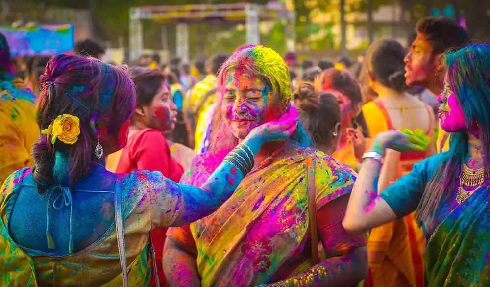
Color harmonies are combinations of colors that work harmoniously together to create visually pleasing and balanced compositions. For example, a complementary color harmony pairs colors from opposite sides of the color wheel, such as red and green or blue and orange. An analogous color harmony uses colors that are adjacent to each other on the color wheel, like various shades of blue and green. By incorporating these harmonies, you can add depth and richness to your photographs. Suppose you’re photographing a vibrant market scene in a photo studio Los Angeles businesses prefer, and you need to capture a variety of produce and clothing. An analogous color scheme of warm yellows, oranges, and reds can evoke the lively and energetic atmosphere of the setting, making your images more visually engaging and impactful.
Make Color the Focal Point
Using color as a focal point can draw your viewers’ attention to a specific element within your photograph. To implement this tip effectively, isolate a dominant color within your frame while ensuring that it contrasts with the surrounding colors. When photographing a bustling city street in downtown Los Angeles, you may choose to focus on a bright red fire hydrant amid a sea of neutral-colored buildings and pavement. The vibrant red will naturally become the primary focus of the image, creating a visually arresting composition that guides the viewer’s eye to the key element.

Embrace Contrast
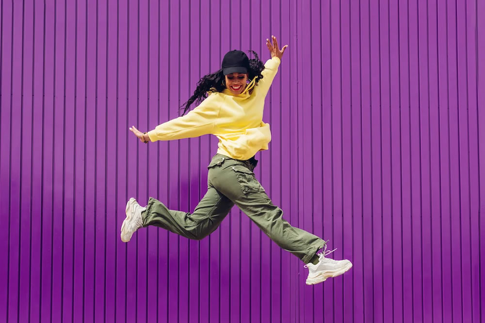
Utilizing high contrast between your subject and the background can make your subject stand out vividly, while low contrast can create a softer and more harmonious appearance. Experiment with contrast to create dynamic and visually compelling images that reflect the energy and vibrancy of your subject. When photographing an American football player on a brightly lit field, for example, the contrast between the athlete’s vividly colored uniform and the green grass can emphasize the subject’s strength and presence.
Control Color Temperature
Color temperature refers to the warmth or coolness of a color, which is often measured in Kelvin. Mastering this aspect can significantly impact your photos, as it can help you maintain the authenticity of colors and effectively capture the mood of your scenes. For a natural look, ensure you adjust your camera’s white balance settings according to the lighting conditions. When photographing a sunlit autumn scene in a park, for instance, you might want to set your white balance to a warm color temperature (e.g., 5000K) to enhance the golden hues of the falling leaves and create a cozy, inviting atmosphere.
Utilize Selective Color Technique
In selective color photography, you desaturate most of an image while retaining specific colors as an accent. For instance, in an American landscape photograph featuring a vivid red barn in a field of green, you can opt to keep only the red of the barn in color while converting the rest to black and white. This approach draws the viewer’s attention to the focal point while adding a creative touch to the composition. With proper application, the selective color technique can yield dramatic and artistic effects.

Enhance Color During Post-Processing
Post-processing is a valuable tool for fine-tuning and enhancing colors in your photographs. Use software like Adobe Lightroom or Photoshop to adjust color parameters such as saturation, vibrancy, and hue. Let’s say you’re working on a landscape shot of the Grand Canyon. With such a subject, you can amplify the saturation of the red and orange hues of the rock formations to capture the intensity of the natural colors. Be cautious not to overdo it, though. Keep in mind that the goal is to enhance colors while maintaining a natural and authentic appearance.
Experiment with Filters and Gels
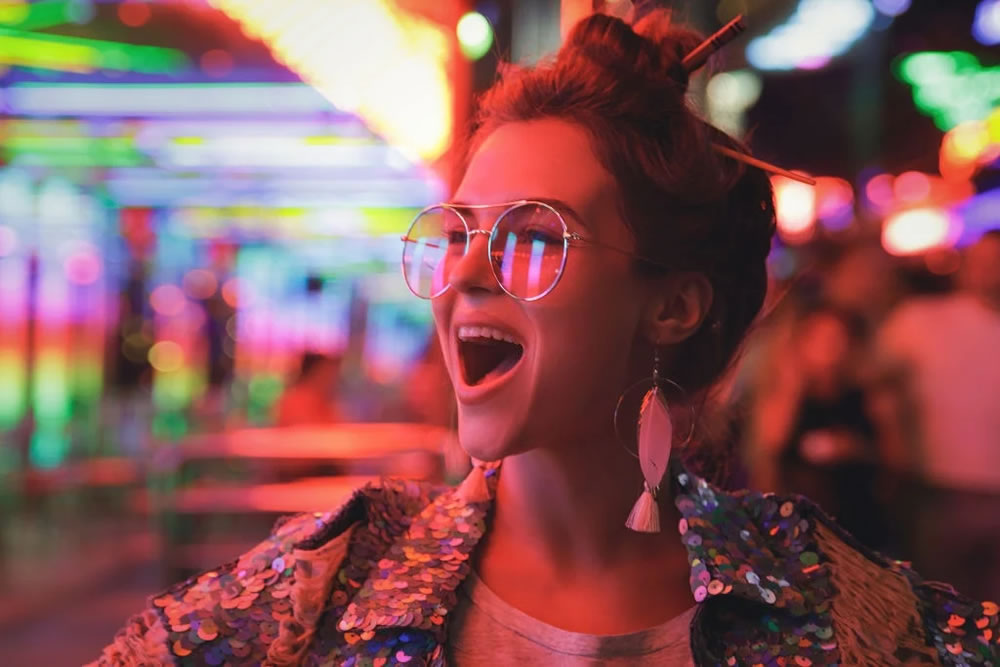
Using colored filters or gels on your camera lenses or lighting equipment add color effects and create unique atmospheres in your photos. While photographing a fashion model against an industrial background in a city, you can use a blue gel on a flash to create a cool and edgy look. Experimenting with filters and gels allows you to infuse your photos with creative and distinctive color variations that can set your work apart from the rest.
Improving your sensibility for colors is a journey of exploration and refinement. It involves continuous practice, observation, and experimentation. By honing your sensitivity to colors, you’ll not only elevate your photography but also tell more profound and resonant narratives through the art of visual storytelling.
