![]()
A couple of weeks ago, Leica announced the Leica LUX camera app, the legendary German company’s first smartphone app for taking photos. While the company has produced its FOTOS app for many years, this is its first dedicated to smartphone photography.
Leica LUX is a premium camera app available for iOS devices aimed at photographers looking for more advanced control over their shots, along with some unique features you’ll only find from Leica. The app combines a sleek, user-friendly interface with novel features that, on the surface, should make it stand out in a crowded market.
So, the question then is, how does it stack up? Let’s find out.
Note: All of the photos presented here are unedited, straight out of the app — though several are cropped in post — with the corresponding preset noted for each.
Key Features
Manual Controls
![]()
Like any of the best third-party apps, Leica LUX features several manual features, allowing users more control over their photos than the stock photo app offers.
There’s focus peaking, which highlights the in-focus areas of the frame with a colored overlay. Unlike some other third-party apps, you cannot change the color of the focus peaking, which is red by default. Additionally, the app includes a real-time histogram, providing a visual representation of the exposure levels in the scene. I do wish there was an option for an RGB histogram instead of just a luminance histogram.
Exposure compensation, which you can adjust by swiping left and right, sits at the bottom of the viewfinder and is always ready to use (which is very lovely). Swiping down at the bottom of the image area will bring up white balance, ISO, shutter speed, and focus settings, which you can lock at whatever settings you want (such as base ISO). The first time you do this, the app will warn you that manual exposure controls are limited by iOS to 12-megapixel captures.
![]()
This is interesting because ProCamera, my usual app of choice, does not have this limitation. However, I checked Halide Mark II, and it does. It is not clear to me how or why ProCamera is able to get around this (or why it’s a limitation to begin with), but either way, it’s not just Leica’s app.
There are also options for a rule of thirds grid, level, flash (on/off/auto), and a self-timer. Pretty standard stuff.
Unfortunately, that’s about it. It’s simple and clean, but I’d hesitate to call a paucity of features a perk. ProCamera, for example, offers — in addition to these same features — things like a tiltmeter, eight aspect ratios, focus and exposure lock, an intervalometer, TIFF support, 3/5/7 exposure bracketing, over and underexposure zebras, capture quality settings, photo and video “zoom,” copyright EXIF data, the ability to edit photos, and a plethora of customizable button and touchscreen options, to name a few. Not to mention, ProCamera can shoot 4K 10-bit Dolby Vision video in both HEVC and ProRes HQ. Leica LUX does not offer video at all.
Capture Formats
![]()
Leica LUX supports RAW capture — both regular DNG RAW files and Apple’s 10-bit computational ProRAW format. You can also select between either JPEG or HEIF, and you have the option of recording both regular RAW or ProRAW plus JPEG or HEIF files at the same time. JPEG offers greater compatibility across devices and programs, while HEIF is a 10-bit (instead of JPEG’s 8-bit) format with more efficient compression, yielding better image quality and smaller file sizes. Most of the time, I shot ProRAW + HEIF.
When shooting in Aperture mode, only JPEG or HEIF are available, the same as the iPhone’s Portrait mode and all other third-party apps that I’ve used.
On the 15 Pro Max (and I assume the 15 Pro), you can save files as either 12MP or 48MP; unlike the native camera app, there is no 24MP option. In Aperture mode, you are restricted to 12MP (again, the same as the stock iPhone app).
In Photo mode, you can choose between 13mm, 24mm, 48mm, and 120mm. There are no 28mm or 35mm options like the standard iPhone photo app offers. In Aperture mode, you can choose between 28mm, 35mm, 50mm, and 135mm (the latter option is only available on the 15 Pro Max, leveraging its much longer telephoto lens).
An option I would like to see included in the app is the ability to “save separately” when shooting both RAW/ProRAW and HEIF/JPEG. Personally, I prefer for those to be separated in the photo library — you know which is which, and it makes sharing or Airdropping them to the computer easier.
Aperture Mode

One of Leica LUX’s most touted features is its Aperture mode, which leverages the capabilities of dual-lens iPhones to create shallow depth-of-field effects via depth mapping. It’s essentially the same as Apple’s Portrait mode with one key difference: you can choose from several Leica “lens” options designed to mimic those lenses’ look.

These include the Leica Summilux-M 28mm f/1.4, Summilux-M 35mm f/1.4 ASPH, Noctilux-M 50mm f/1.2, and (on the 15 Pro Max) the APO-Telyt-M 135mm f/3.4. As you would expect, choosing any of these will crop the photo to reflect that focal length’s field of view, though all of them end up as 12MP files (even using the telephoto lens, which means some upsizing must happen behind the scenes). I’m surprised there is no 75mm Noctilux/Summilux and/or 90mm Summilux option for iPhones that have the shorter (77mm-equivalent) telephoto lens, especially given that there are far more models with that lens than the 15 Pro Max’s 120mm-equivalent. This seems like wasted potential.
Note: After I wrote this, the app was updated, and it made mention of a 90mm Thambar setting. This is not present on my 15 Pro Max, and it is not mentioned in the press release, but I am assuming iPhones with the shorter telephoto lens do have a 90mm Thambar simulation.

The camera’s Aperture Mode performs really well in most situations, leaving me pleasantly surprised. It doesn’t always perfectly handle fine, random details like hair, but neither does the iPhone camera app. The 50mm Noctilux option can even yield some slightly swirly bokeh, which is certainly accurate to that lens.
Leica Looks
The other most advertised feature of Leica LUX are the “Leica Looks.” According to Leica, the app “uses Leica color science to offer a selection of color gradations and film presets that emulate those of Leica cameras.” I’m not sure what Leica means by emulating film or its cameras — you can’t emulate a film camera, after all, and Leica digital cameras’ color and tonal response varies greatly across its models. None of the preset names indicate what they are emulating.






At any rate, I actually really like some of the Leica Looks. Leica Contemporary is very nice and probably my favorite, with pleasant but not overbearing contrast and saturation and gentle transitions from midtones to three-quarter tones to highlights. It’s a great choice if you want something that is extremely usable straight out of the gate. Leica Vivid is pretty good as well; unlike some “vivid” profiles, it’s not excessive. Leica Natural is muted and subtle, which makes for a great starting point if you want to edit the photo yourself. Leica Eternal is simply garish in most circumstances and easily the worst of all of them.


The two black-and-white modes are very well implemented. Sometimes, the high contrast is too heavy, but that’s to be expected, depending on your lighting. The Leica Blue is designed to mimic cyanotypes, while Selenium produces a subtle brown tint similar to selenium-toned black-and-white prints.



I do wish you could fine-tune the profiles (e.g., reduce/increase saturation or contrast) as you can with a regular camera.
Usability
![]()
Leica LUX’s interface is designed with usability in mind, attempting to balance advanced functionality with a clean, accessible layout. It strikes a nice middle ground between offering advanced features and maintaining an intuitive interface that caters to both novice and experienced photographers. The app’s interface is minimalist and functional, employing a gesture-based control system rather than leaning too button-heavy. I think the app needs to change from a swipe down to a swipe up to access the manual exposure/focus controls. Swiping down is not intuitive, and it makes it very easy to accidentally change the exposure compensation.
One huge issue is that Leica LUX allows for practically no customization. Unlike apps such as Halide and ProCamera, users cannot arrange the interface elements to suit their individual needs. For example, if you frequently adjust ISO or white balance and want these controls placed in a more accessible position on the screen, you’re out of luck.
There are many things that are just kind of annoying about the design/layout and the fact that there’s no ability to customize it. For example, switching between Photo and Aperture modes requires you to tap the Mode button in the bottom right and then choose either Photo or Aperture. There should just be a dedicated button to toggle between the modes (or make it an option for one of the function buttons).
And beyond that annoyance, to change the capture format, you have to go back into the menu, which requires way too much work — you should be able to just tap the format icon in the top right, but that icon is purely informative, apparently. Two weeks into using the app, I discovered that tapping the format icon in the top right actually does cycle through the options — it’s just highly unresponsive. I can tap it fifteen times in a row, and it does nothing. Toggling the grid on and off (in the top left) has no such problem. Perhaps it’s an issue because of my screen protector, but most other people will have screen protectors as well.
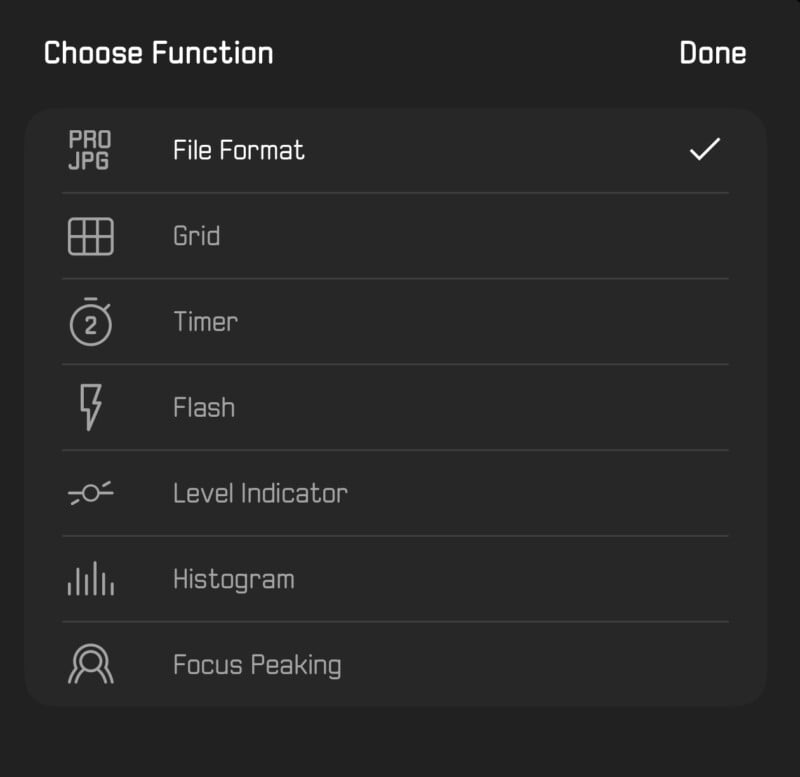
However, you are able to alter the three function buttons (top right, top left, and bottom left just below the viewfinder) by long-pressing them, so I was able to remap the format icon to the bottom left. It would be nice if they allowed you to choose from more options to map to these icons, such as cycling between Photo and Aperture mode.
Image Quality
This won’t be a real in-depth analysis of the iPhone’s lenses or a ton of A to B comparisons — the former is a known quantity that many others have written about, and the latter is something that, well, I didn’t have much time for. Results from Leica LUX don’t deviate much from the standard iPhone app in most situations. And that’s not necessarily a bad thing.
HEIF or JPEG capture is similar to what you get from the native app, nothing exciting there. ProRAW is also on the same playing field, and that’s a little disappointing. ProRAW is an excellent format — or at least it could be great — because it leverages the power of computational photography combined with (most of) the flexibility and latitude of RAW capture.

The problem with ProRAW (and this goes for Leica LUX as well as the native camera app) is that there’s too much going on — namely, too much noise reduction and overly aggressive sharpening. Once those are baked in, there’s no pulling them back. Thankfully, however, ProRAW from Leica LUX seems to have less saturation and contrast than the iPhone camera app — it’s very easy to boost saturation or contrast (an additive process) but much more difficult to pull it back (a subtractive process).
I want to be clear that the noise reduction and sharpening are not exclusively a problem with Leica LUX; they are a problem with almost every third-party app on the market, including the native iPhone camera app.
Now, maybe there’s a reason that all these other apps also use aggressive tone-mapping, unnecessarily substantial noise reduction, and excessive sharpening. I’m not sure what it would be or why we can’t have the dynamic range and reduced noise advantages of computational photography without adding all of that stuff on top of it — maybe it’s something in Apple’s ProRAW pipeline itself. But I was really hoping that maybe there would finally be an app that solved this problem. No such luck here, unfortunately.
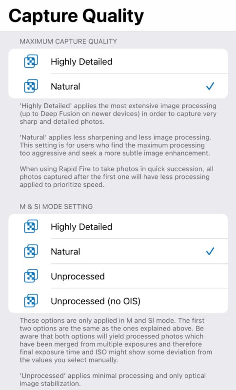
ProCamera does offer some settings like this, allowing you to choose between “Highly Detailed” and “Natural” (and “unprocessed” in other modes). Doing this significantly improves the ProRAW (and HEIF) results, though they still aren’t on par with regular RAW. Still, even if they aren’t as good as I’d like, it would be nice to see Leica LUX offer similar options.
Another huge issue is that the app offers nothing like the iPhone’s “night mode.” The shutter speed bottoms out at 1/15 sec, at which point the app will jack the ISO up until it tops out at 12,800. This rather severely limits the app’s usability and image quality in lower-light environments. The iPhone’s night mode is rather incredible — I’ve taken photos of stars in the pitch blackness of Death Valley at 10 seconds handheld that honestly blew me away. ProCamera even offers a night mode, as do numerous other third-party apps (some are even dedicated to it). So obviously, it is possible, but you’ll find no such capability here.
The Elephant in the Room: Pricing
Let’s get this out of the way: the Leica LUX app is expensive. It costs $6.99 per month or $69.99 per year, and no lifetime purchase option exists. Compare this to Halide Mark II — which costs $2.99 per month, $11.99 per year, or $59.99 for a perpetual subscription — or ProCamera — which is $14.99 for a lifetime subscription and either $11.99 per year or $49.99 for lifetime if you upgrade to ProCamera Up. Those are two of the most advanced, feature-rich, and robust camera apps on the market, and even the most expensive version of them is $10 cheaper for a perpetual subscription than Leica LUX is for one year.
While there are things to like about Leica LUX, both Halide and ProCamera have more features and tools and a more customizable interface — at least currently. Leica needs to bring the pricing down considerably to remain competitive and worthy of an honest recommendation. I also think it should be free for anyone who purchases a new Leica camera or lens. And perhaps it will — after all, Leica initially charged people for its FOTOS app.
Are There Alternatives?

There are many, which I detailed in a past article on the best iPhone camera apps, and Jeremy Gray covered in his article on essential photography apps. The two best alternatives are the previously mentioned Halide Mark II and ProCamera (or the more advanced ProCamera Up). Both are full of just about every feature you could ask for (plus some), are highly customizable, and are comparatively extremely affordable.
Should You Buy It?

No. At this time, it is very difficult to recommend due to its premium pricing, lack of premium features, and numerous issues that need to be addressed. Honestly, right now, it feels more like a quasi-beta product than one ready for prime time. However, there is a two-week free trial at the moment, so it can’t hurt to check it out. Perhaps you will love the Leica Looks or lens simulations enough to justify buying it — both of those are very well-implemented. It’s the rest that needs work.
It is worth noting that in the relatively limited time I have been using the app, Leica has introduced numerous bug fixes and updates, responded positively to all of my feedback, and even implemented several of my suggestions. If they can fix some of the app’s most prominent existing shortcomings and bring the price down into the realm of reason, then it will be worth consideration.
