
It’s time to go dark (mode). Here’s everything you need to know about designing stylish, trendy black backgrounds for your website or app.
More and more mainstream apps and sites, like Duolingo and Uber, are switching to a dark design, and for good reason. Dark websites don’t just look more polished and dramatic, they’re also easier on the eyes than those with bright or white backgrounds.
Ready to make the dark-mode trend your own? We’ve compiled a few pro tips to help you effectively use dark backgrounds in your website and app designs. We’ll cover which HEX codes to use and which colors to pair with dark tones.
You’ll also learn how to integrate texture, photos, and gradients into a dark background to create an immersive black website design.
How to Use Color with Black Websites
Black is a perennially chic color, long favored by fashion and print designers. But, it’s only recently that the color achieved widespread appeal in web design.

A dark website design using this image via contributor YARUNIV Studio.
In web design, the HEX code #000000 is pure black. While #000000 achieves a completely black background across your website layout, it can lack depth and interest. Users might see it as an indifferent absence of color rather than a bold statement.
To deliver a more subtle take on the dark background trend, try using alternative HEX blacks instead of going all in on #000000. Warmer and cooler blacks like charcoal (#36454f) or slate gray (#3D4849) can add more character to your dark website designs without sacrificing style.
In fact, there are many recognized variations of black out there—jet, onyx, and ebony, for example—and each suits a different purpose.
Just keep your options top of mind as you embrace the darkness. Because, while pairing #000000 with crisp white fonts and white website elements can create a high-impact scheme (see below), other schemes will benefit from subtly different blacks.
Different tones of black also pair beautifully with specific color groups, such as pastels, neons, or brights.
Let’s take a look at five color palettes for contemporary and cutting-edge black website backgrounds. Use these palettes to give your site’s black design more depth and drama.
You’ll also find tips for using photos and textures as part of a dark website scheme. (And, be sure to check out our guide to the color black to explore the range of blacks available to designers and to learn more about psychology behind this powerful hue).
Black Website Design #1: Minimalist Black and White
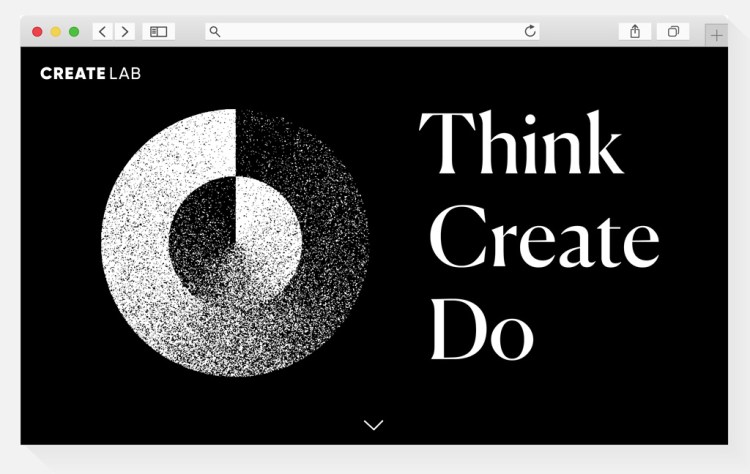
Black and white is the highest contrast color combination you can use on the web. This interplay of dark and light can make for impactful and elegant website layouts.
The high contrast between black and white also makes websites more user-friendly and accessible for individuals with visual impairment. It’s also a good color scheme to adopt if you’re set on using serif, italic, or novelty fonts, which are usually harder to read on screens than sans serifs.
Additionally, a black background helps to frame starker white elements and draws the eye to white text or white buttons. A black background can also give an impression of vastness, making your website feel like it extends beyond the edges of the screen.
Help your users navigate their way through the expansiveness of a dark background by pulling out actionable elements in stark white. The contrast in color will help direct the UX pathway.
Try these black and white color schemes and backgrounds in your website designs:

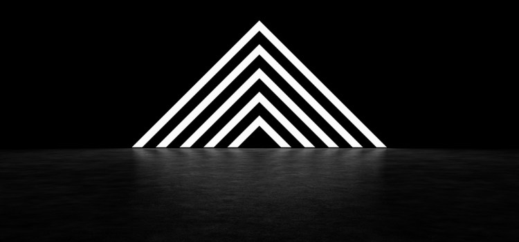
Black Website Design #2: Black Textures
A stark black background can look a little flat at times, so bringing texture into your designs can be surprisingly transformative.
Textures don’t have to be obvious. A background photo with subtle noise, glitch, or dust textures can be enough to give your website more depth and interest.
A time-tested technique of print designers, web design can also benefit from a textured background’s ability to make a layout feel (ironically) less digitized and clinical.
An alternative approach is to look for more striking patterns and geometric designs. When rendered in all black, these still retain a minimalist spirit, and they’re an effective way to bring more interest to a site layout when you don’t want to use photos or too much typography.
They also still provide a blank canvas of dark background that allows you to be more playful with the color of buttons and text.
Here are some simple black textures to use when designing black websites:


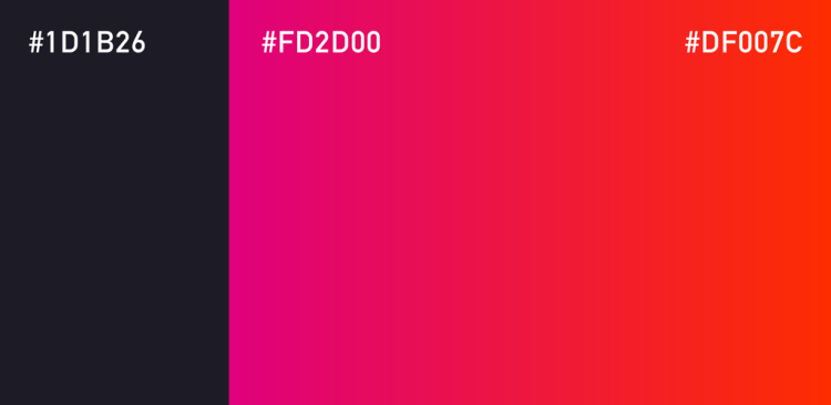
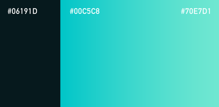
Black Website Design #3: Neon Gradients
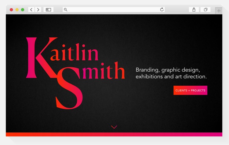
Neon text paired with a black background can give your website a retro-futuristic feel.
And, while the neon and black combination was long associated with tech firms, web developers, and The Matrix, the look has found fresh new footing in the contemporary design landscape.
Today, a range of businesses can benefit from the eye-catching potential of a neon-black palette on their websites and apps.
How can designers make the palette more tech-chic than tech-geek? Gradient neon colors bring more dynamism and depth to website layouts when paired with an inky-black background, especially when used with large-scale typography and scrollable sections.
You can create gradient colors using CSS code. Selecting and coding your color with the online CSS Gradient tool is easy. Use the sliders to select colors for simple bicolor linear gradients or more complex radial gradients, and copy the code beneath for inserting into your CSS editor.
Try out these two neon and black schemes to give your website a contemporary twist on ’80s style.
Alternatively, inject your website’s dark background with instant neon color by using a photo. Here’s one wonderful example by contributor railway fx:

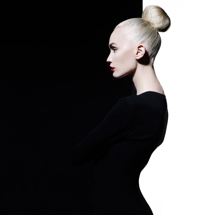
Black Website Design #4: Full-Width Photos
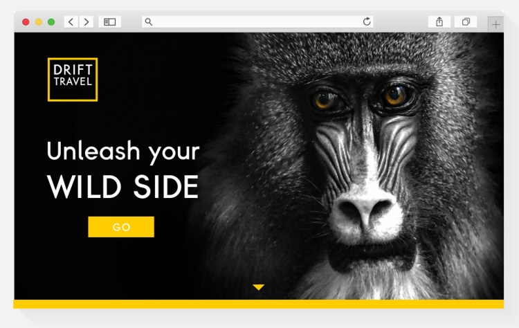
Photos with black backgrounds make for incredibly stylish and dramatic images. No wonder they are a style frequently favored by fashion and lifestyle photographers. Photos with black backgrounds give websites an immersive, cinematic quality, which suits a wide range of businesses, like corporate services, fashion, travel, and eCommerce.
A simple trick of the trade? Use a photo as a not-so-subtle visual cue, using the angle of eyes or hand gestures to direct the user’s attention to important buttons, offers, or menu items. (You can find extremely high-resolution images with black backgrounds in the Shutterstock library, suitable for even the largest retina screens.)
Need to extend the width of a photo to suit responsive web designs? The lack of detail in black backgrounds allow you to seamlessly extend the edge of photos. Use the Eyedropper plugin for Chrome to pick up the specific HEX tone from your chosen photo.
Below, check out edited versions of our favorite photos with black backgrounds. These images will help you create compelling and immersive full-width web layouts.


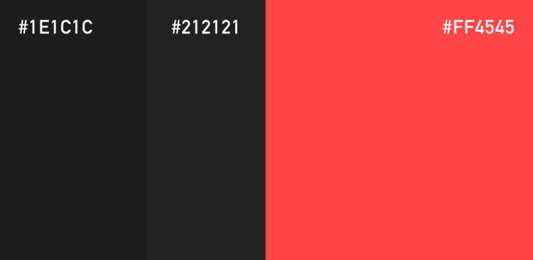
Black Website Design #5: Charcoal and Slate
Website design with an off-black background, courtesy of this stylish slate plate image from contributor YARUNIV Studio.
There might be fifty shades of gray, but there are just as many shades of black, as well. From ebony to onyx, jet to charcoal, slate to taupe, there’s a wealth of blacks to choose from, with the HEX codes to match.
Off-black shades can give your dark website designs a more subtle, professional look, which makes them great for corporate websites or stylish design businesses, like architects and interior designers.
Less stark than pure black, tones of charcoal and slate are quietly elegant. They also make a stylish foil for a broad range of accent colors, such as coral, mint, dusky pink, and sky blue.
The color scheme favored by the SwissOne Capital website is an elegant exercise in how to use a more subtle charcoal-black palette on a website layout. Tomato red is used sparingly as an eye-drawing accent, with dark slate gray and crisp white providing a corporate-appropriate backdrop.
Experiment with this punchy yet elegant color scheme on your own website design, or try a slate-tinted photo for a subtly dark backdrop:

Take Your Website Design to the Next Level with Shutterstock Flex
Need beautiful photography to form the foundation of your website? We’ve got you covered. With Shutterstock Flex, you’ll have all-in-one access to our massive library, plus the FLEXibility you need to select the perfect mix of assets every time.
Looking for more website design inspiration? Check out these handy tips and techniques for designing beautiful and effective websites:
License this cover image via contributor Mykolastock.
Recently viewed
${excerpt}