![]()
Over a decade ago, Lytro launched with a curious idea: what if a photo didn’t have to stay the same after it was taken? What if perspective had control that could be played with again and again?
The idea was brilliant but Lytro was too ahead of its time: the technology of 2011 just couldn’t effectively bring the dream to life as the experience was marred by poor image quality. In 2018 and after years of just scraping by, Lytro shut its doors forever. Some of its people were acquired by Google while other parts of the company and its hardware appear to have been folded into another entity on the other side of the world. Lytro and “the camera of the future” were gone.
But what Lytro inspired is still very much alive. Portrait Mode in modern smartphones continues to improve and the most recent iterations allow photographers to edit the strength of blur or even change the focal point of an image by altering the focus point. What most people carry around in their pockets is remarkably better than what Lytro first attempted 14 years ago, but there is still room for improvement.
The now final version of Adobe’s AI Lens Blur — which rolls out into Photoshop, Lightroom, and Adobe Camera RAW today after being in Early Access since last year — brings that capability to any image captured with any camera and feels like the final form of what Lytro was trying to do back in 2012. Thanks to the advancements of AI, special hardware isn’t necessary and instead Adobe relies on depth maps it draws from image data (it can also use the depth maps created by smartphones like the iPhone).
Most photographers likely look at artificial blur with an air of disdain. For years, it’s been unreliable and — frankly — bad. However, modern takes that use depth information at the point of capture has made huge strides. Apple, Samsung, and Google all have shown major improvements to the artificial blur found in portraits because of that depth information.
That makes what Adobe is doing even more impressive since it boasts similar capability without access to any of that depth information — it has to draw its own. Adobe’s original AI, Sensei, appears to be doing the lion’s share of the processing here. It sees an image and is able to draw a surprisingly accurate idea of depth from it.
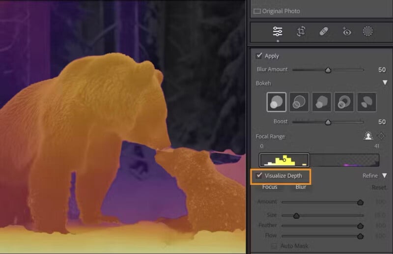
Once that map is drawn, what Lightroom is seeing can also be toggled on and off through the “Visualize Depth” option, which shows charts the depth by color: yellow covers the area that has “near” focal range, blues and purples cover the area that is “far” away, and white is currently the area in focus if you’re adjusting that in the Focal Range control.

Again, most photographers probably aren’t yet swayed because of poor experiences in the past, but we at PetaPixel were very surprised at how good Adobe’s AI was at accurately portraying depth. Because it allows refocusing in post and also lets you control exactly how much blur you might want and how the bokeh appears, there are a range of possible use cases for photographers to make their good images even better.

I don’t see myself using this new feature at its maximum capability. Instead, I think it will work best when it is applied with a light touch — similar to how I use the Clarity or Dehaze slider.
Photographers’ relationship with Adobe is a complicated one and it isn’t getting any simpler. I don’t always agree with the company’s leadership and I certainly take issue with its advertising — the ASMP and I are on the same page there — but I also see the benefit of some of the tools Adobe rolls out. I would certainly feel a lot better about using AI Lens Blur if Adobe’s CEO seemed like he actually understood the people who use his software, for example.
That said, it’s hard not to be impressed with what this feature does. The dream that was Lytro lives on.
