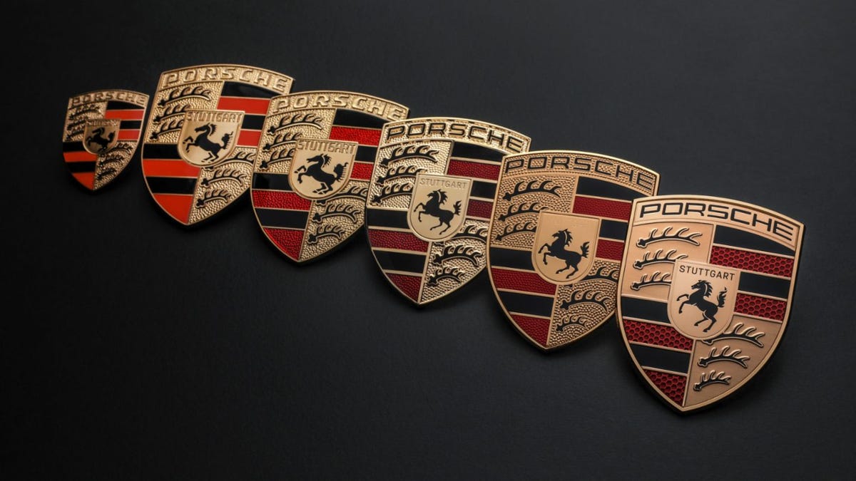
The now-iconic Porsche crest was originally developed for the brand in the mid-1950s. The Stuttgart city crest is flanked by the stylized antlers and colors of the Württemberg-Hohenzollern region coat of arms. The logo of perhaps the most well-known sports car brand in the world is basically just the medieval version of the company’s address. Around 1962, while the 911 was getting ready to pick up where the 356 left off, the company was considering a rebrand.
Apropos of nothing, Stuttgart’s city symbol is a horse because the original settlement in that area was a horse studding farm. Stuttgart. Stutt Garten. Stud garden.
Prior to the emblem’s creation in 1951—by New York-based importer and marketing genius Max Hoffman—the brand simply used a stylized PORSCHE wordmark. The emblem was barely a decade old by the time the company was considering its replacement. While the idea seems sacrilegious in 2024, back then it was no more unthinkable than Kia replacing its logo with a more modern design recently. It’s a branding thing.
The company’s then Head of Advertising, Hermann Lapper, assembled a small team of company employees to devise a series of possible new Porsche logos. Perhaps something simpler than the busy crest the company had been using. Something modern for a new age of the company. It was decided that a stylized P would be the new face of the company, and five designs were created in collaboration with frequent Porsche collaborator and designer Hanns Lohrer.
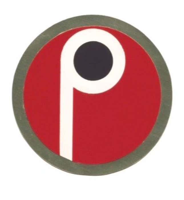
This one is simple and easy to understand. The P on a field of red. It looks familiar for some reason, and I can’t place it.
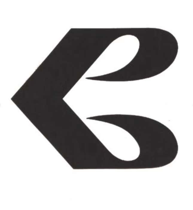
This one doesn’t work at all, if you ask me. I see where they went with it, but it’s not right. The P is reflected with a second upside-down P below it, but together it just looks like a weird E.
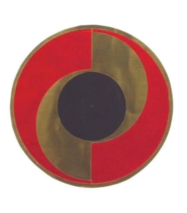
This emblem is really cool, and I could see it on a car for sure. It’s not right for Porsche, and it would be dated by the end of the decade, but it looks great.
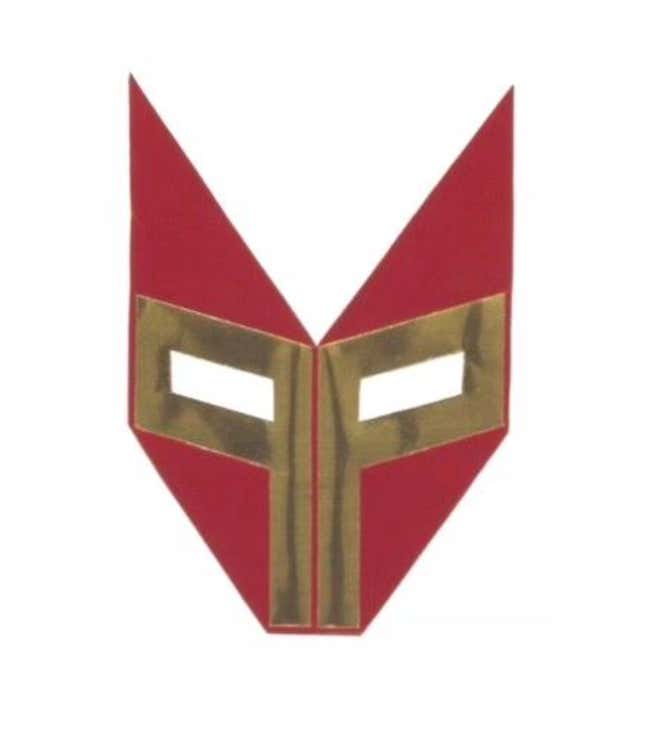
This one is like a mask for a little luchador guy. A fox. El zorro.
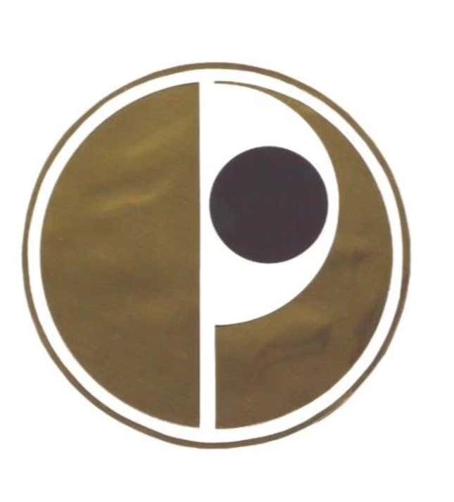
Turn it on its side and this is a sneaky eye. It’s better as an emblem for an evil international spy syndicate called The Plot or something.
Ultimately Porsche decided to stick with the crest, and all of these designs were slipped into a folder for a few decades. What do you think, are any of these better than the horse sex farm crest?