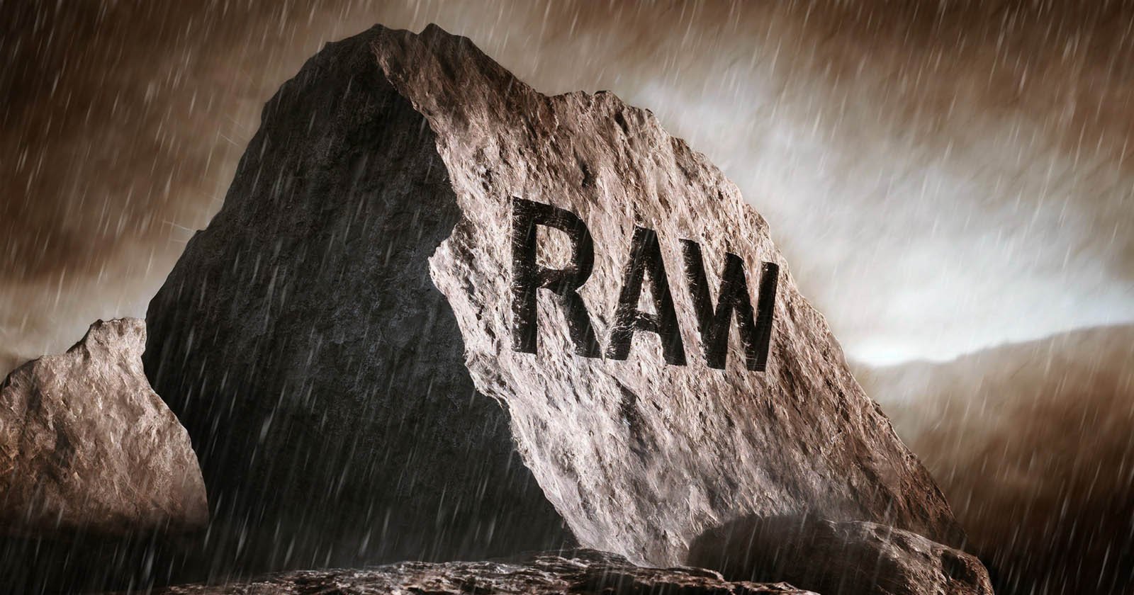
Twenty years ago, I was just starting to make some headway as a film-shooting stock photographer. It was a fun time, but the digital age soon dawned. I shot JPEGs on maybe my first day out with a digital camera, and then I was onto RAW.
JPEGs are inherently risky if they’re all you shoot, not least because their exposure latitude falls some 4-5 stops inside the dynamic range of a RAW file. Why would you make life hard for yourself? The more you can focus on the image, the better.
There are good reasons for sometimes limiting yourself, however.
I followed the RAW path assiduously for two decades: didn’t even think about JPEGs except when I was using cell phones. Then, recently, my propensity for erratic thinking and easy distraction caused me to lose my RAW religion.
Preceding Events
I’ve had a stock photography mindset for ages. One of the problems with stock photography, from my perspective anyway, is the inability to fully express yourself with the files you produce. The final interpretation of the picture is usually left to the oft-unknown client. And usually, it’s just a flat reproduction.
There are some exceptions to this rigidity, but most stock libraries don’t want you to go far down the rabbit hole of individual taste when you submit files. Putting a big personal stamp on pictures limits their salability. A basic example of this is when you convert an image to black and white—you wouldn’t often do it.
To satisfy my creative urges and rebel against my mercenary side, I’ve enjoyed toying with digital images over the years. I tend to play around with color, tone, and overlays. I’m interested in the look of the online image as well as the printed one. Until recently, most of this experimentation was carried out post-factum, using a PC.
The Path of Distraction
People who are prone to easy distraction follow an unpredictable track with their thought processes. Topics only tenuously linked are nonetheless linked, and so you end up in an unexpected place that hasn’t much to do with the starting point.
Recent developments in image processing, and especially AI-enhanced noise reduction, have caused me to revisit some old files. I stumbled upon pictures from an old Sigma DP2 Merrill camera I owned and was blown away once more by their technical quality.
I briefly entertained the idea of buying the quirky DP2 Merrill again (OTT for most stock purposes), which lured me down the Google path of “best vintage digital cameras”. Soon, I was looking at the Ricoh GR Digital. It piqued my attention.
My old Ricoh GR1 film camera was a lovely thing. I eBayed it years ago. Here was the first digital version of that with a reputation as a street-machine that shoots film-like mono JPEGs. The part of my brain that deals with nostalgia was fatally panged.
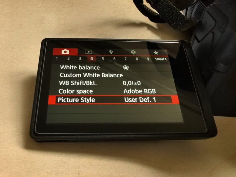
Looking around for a Ricoh GR Digital, I soon realized they were hard to find outside of Japan, and they’re not cheap. I still wanted one, but I sated myself with another idea. What if I create my own baked-in profiles, perhaps with perceived film-like traits? After all, I own perfectly serviceable Canon EOS cameras that include “Picture Styles”.
I also started looking at alternatives to the Ricoh GR Digital. Other cameras didn’t offer the same features—no snap focus or iconic street cred—but they could knock out lovable JPEGs. I didn’t intend to ditch RAW files, but I wanted to see where this led.
Canon Picture Style Editor
I imagine most Canon stills shooters never use the desktop Picture Style Editor. This app lets you adjust RAW or TIFF files to create a look you like and then save that look as a Picture Style. You then transfer the style to your compatible Canon camera.
Initially, I had trouble getting a RAW file to open in Picture Style Editor and never knew why. Not everyone is a fan of the software. Using fresh files without any editing history seemed to help.
You can create picture styles inside a Canon camera, but the desktop app gives you control over discrete ranges of color and tone. A curves tool helps you fine-tune the look in two of the three software panes.
This article isn’t meant to be a tutorial on the software, but I’ll go briefly over the three panes available in the Canon Picture Style Editor:
- Basic: this is the pane where you’ll adjust sharpness, contrast, saturation, and color tone (the latter addresses skin tones according to Canon). The underlying base picture style provides a starting point.
- Six Color-Axes: this lets you adjust individual ranges of colors, namely red, yellow, green, cyan, blue, and magenta. You could use this to mimic a film look without getting into the weeds of the third pane.
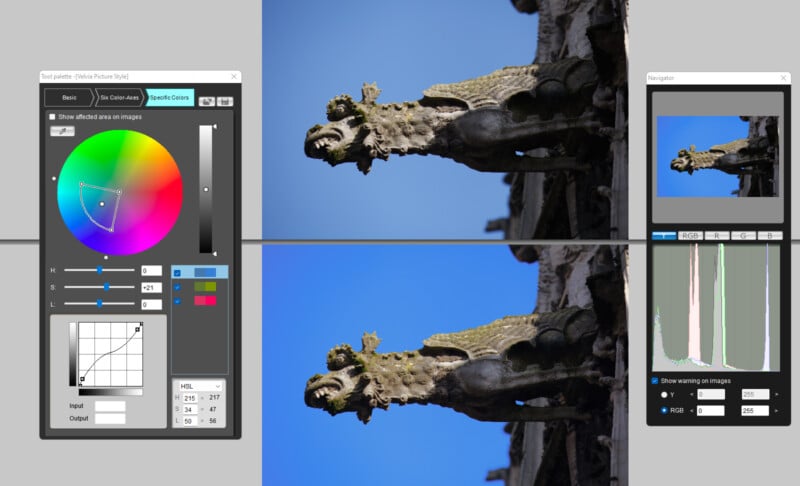
- Specific Colors: useful for creating a unique look, this pane gives control over all hues and provides an eyedropper tool for sampling areas of your picture. A curves tool lets you easily apply changes to specific colors and tones.
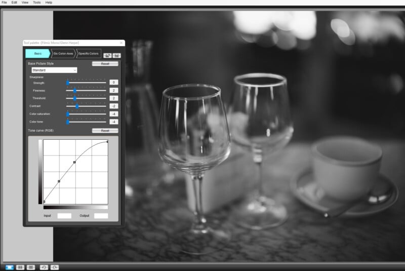
I usually keep the sharpness set to low or zero just to retain more flexibility for later on. A lowish contrast is often beneficial, too, though not if you want that high-contrast Fuji Velvia look (innately hazardous the first time around).
Before you tackle any of the above, you might want to make a white balance adjustment within the “Preliminary Adjustment” tool. This has a radical effect on the starting point and can be used creatively if desired.
Using the Picture Style Editor, I made my own styles, but I also downloaded some for free and even went to the extraordinary length of paying for one. I’m still having fun with it all. In one instance, I tried compressing the dynamic range by about 5% each end for a more subdued, print-like appearance in a black-and-white style.
I’m also interested in movie-style color grading, but that’s at odds with burning a distinctive look into in-camera JPEGs. Some downloadable picture styles are aimed at videographers and are typically neutral (flat) in character. They aim to maximize dynamic range and provide a canvas for post-processing and color grading.
You can still try cine picture styles or profiles on stills photos. Some are flatter than others, and some balance exposure well whilst still yielding pleasing colors. One or two have the oft-seen orange and teal cinematic look, which you may love or hate.
If you’re after a grainy film effect, you can manufacture it one way or another in Photoshop, whether by adding noise or using a film grain overlay. Color.io is an online or desktop app that lets you add realistic grain to photos after color-grading them. This moves away from the notion of cooking everything in-camera, however.
When saving picture styles via the Canon Picture Style Editor, you can check a box to prevent further editing. Most people who sell picture styles or float them free of charge do check the box, so you can’t often edit downloaded styles. Secret recipes stay secret.
Olympus Art Filters
I have a soft spot for Olympus cameras, as my dear old grandfather used to shoot with an Olympus Trip 35 and put on Kodachrome vacation slideshows. That’s another retro camera I’ve looked at, but scanning is not my favorite pastime.
If you peer at cameras from the “noughties”, up pop the early micro four-thirds Olympus Pens with built-in Art Filters. They’re comparatively cheap. Still hankering after the compact GR Digital and its film-like mono output, could I find what I wanted from the Olympus Grainy Film Art Filter?
Sure enough, I bought an Olympus Pen E-PL2, fitted it with an old Olympus 50mm manual lens, and began shooting JPEGs.
Absent focus peaking, manually focusing with this camera isn’t the easiest thing in the world, but I do love the Grainy Film II Art Filter on the Olympus Pen. I’ll get an AF lens for it anon. This filter is useless for stock photography purposes, where files normally need to be clean at 100%, but it looks great if you avoid pixel-peeping.
With the E-PL2, I’m looking for an aesthetic I can enjoy right out of the box. By definition, that means I’ll be shooting more for myself.
The Benefits of Narrowing Your Vision
I return to the original question. Why would you make life hard for yourself by shooting only JPEGs? You don’t have to, of course. You can shoot fine-quality JPEGs alongside RAW files. The main difference is, you’re focusing on and shooting for a very specific look. If you want to, or if the pictures are repeatable, you can go all-out JPEG.
It’s often possible with proprietary software (e.g., Canon DPP) to apply filters and styles after the fact, so you can fall back on that if you’re also shooting RAW. This way, you still get to render the photo the way you intended if the JPEG exposure goes awry.
The histogram on your camera is JPEG-derived, so the picture style or filter you select affects exposure latitude. It’s for this reason that some serious photographers choose the most neutral of picture styles in camera settings. That way, the histogram doesn’t clip so easily and reflects RAW potential a little better.
For sure, it was a wake-up call when I suddenly started blowing highlights and blocking shadows in various JPEGs. How blasé I’d been about exposure these past years!
When you know you’re looking for photos with a particular theme, using a specific film or style, or sporting a single prime lens, it focuses the mind. I believe you look harder and start to see more. It’s easy not to see when you’re carrying a camera. It’s easy to go through the motions.
The above is why I think that picture styles, art filters, black-and-white modes, or in-camera presets of any stripe could improve or reinvigorate your photography. Or mine, at any rate. I see photography as a large umbrella, and if you never reduce its span, you can get lost under the enormity of it and miss everything.
I started digital photography as a disciplinarian, used to throwing whole rolls of exposed slide film into the garbage if I’d had a bad day. I thought nothing could beat producing the final image in the camera, and that post-processing should be minimalistic.
I’ve traveled full circle, now utterly open-minded about digital techniques. The journey to the final result is immaterial—almost. For the first time in ages, though, I’m trying to let the camera do most of the work, and it’s given me a new impetus.